“We loved the ethos of Herringbone as a company, their sustainability credentials, the fact they give back to the community, and that they plant a tree for every kitchen they make. They are also very generous in the advice they give on instagram, and I watched many of their Q&A’s whilst planning our kitchen. Finally, I had never seen a kitchen they had designed that I didn’t like, so that had to be a good start!”
The Design
This kitchen is simply beautiful, from the sleek lines of the cabinets and the symmetry of the space, to the large island and hidden white goods we had such a lovely time designing this kitchen with our wonderful clients.
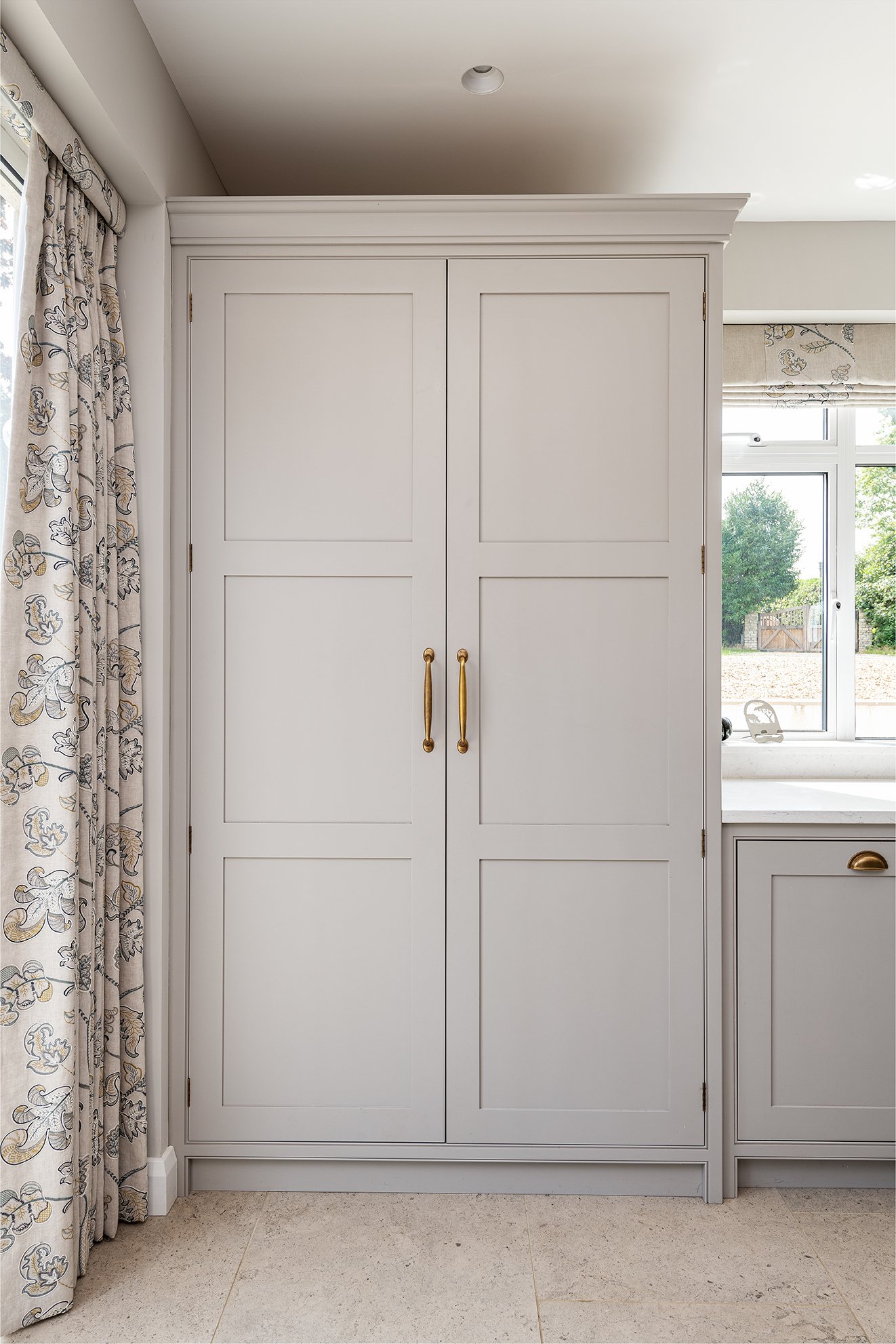
The design features an L-shaped run of lower cabinets, upper cabinets on both sides of the hob with floor to ceiling cabinets hiding away the fridge and freezer. There is a large island in the middle and a large larder dresser to the left of it.
“We really enjoyed our visits to Canterbury to the studio, and our design sessions with David. It was very useful to be able to see the units and hardware in person, and through our brainstorms with David, we made many changes which have definitely really enhanced the final result.”
The kitchen is designed in our Rye Range and bespokely fitted to perfectly fit into this large kitchen extension. It’s painted in a lovely off-white which makes the island stand out in a lovely dark blue tone.


